The Challenge
Create a visual identity system and brand for a unique conference concept.
Date
April, 2017
The Concept
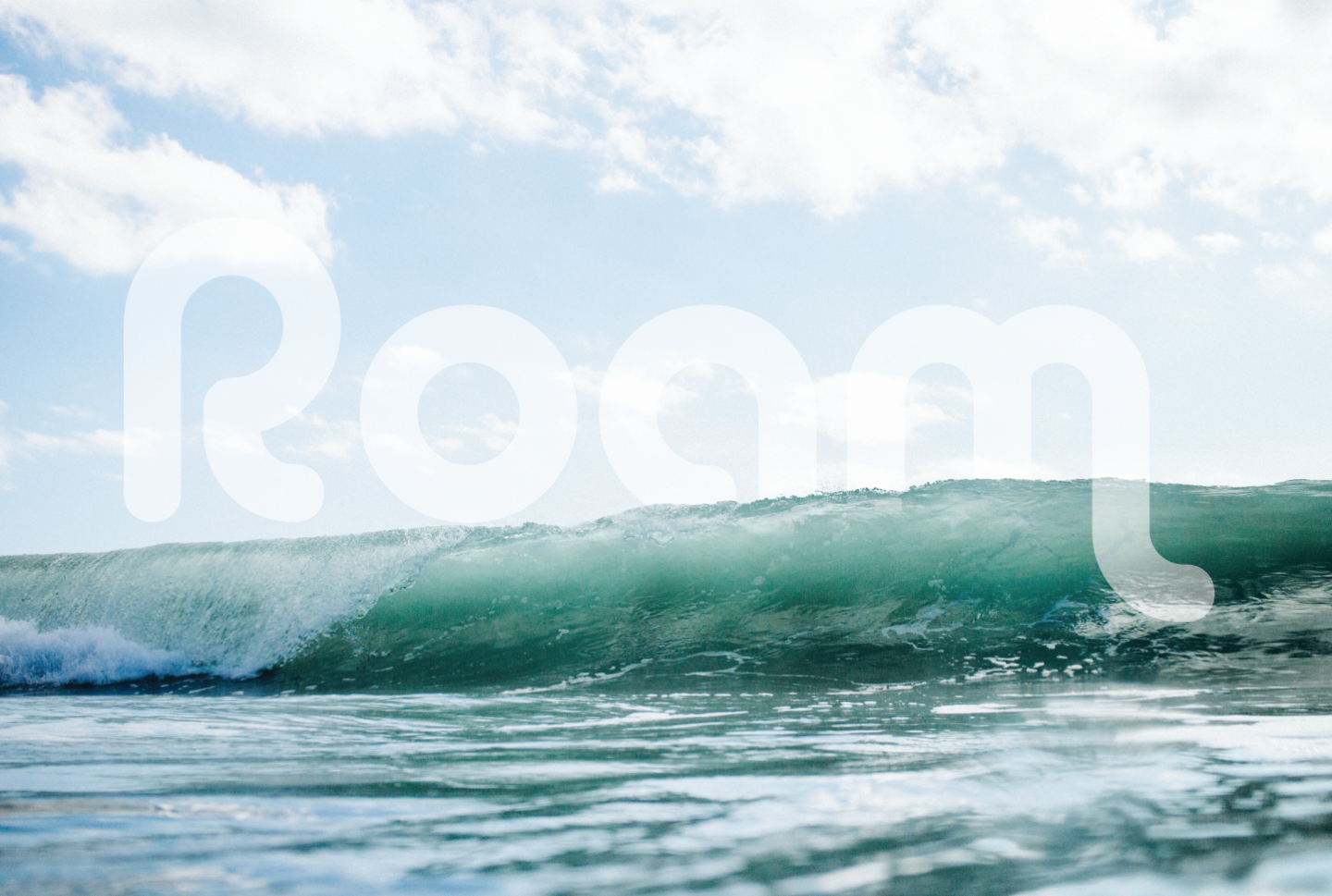
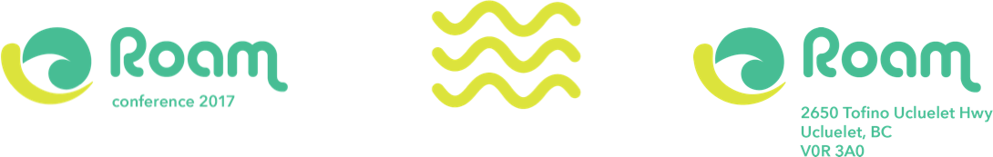
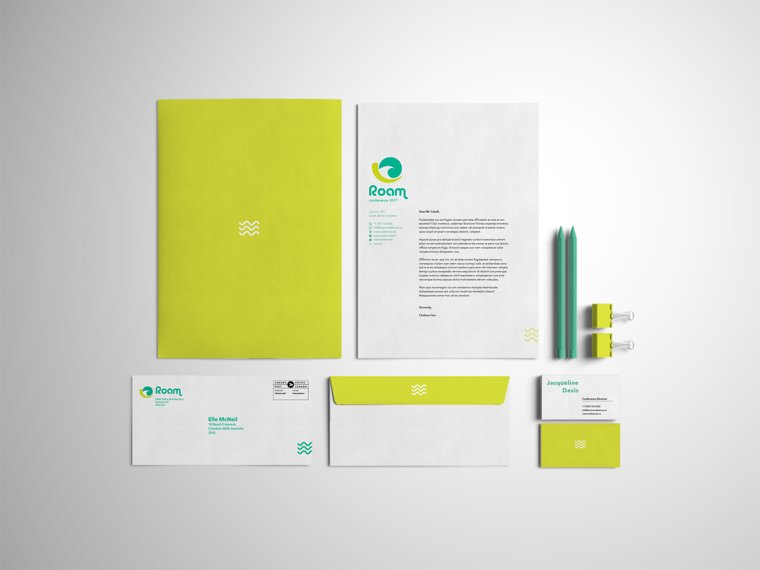
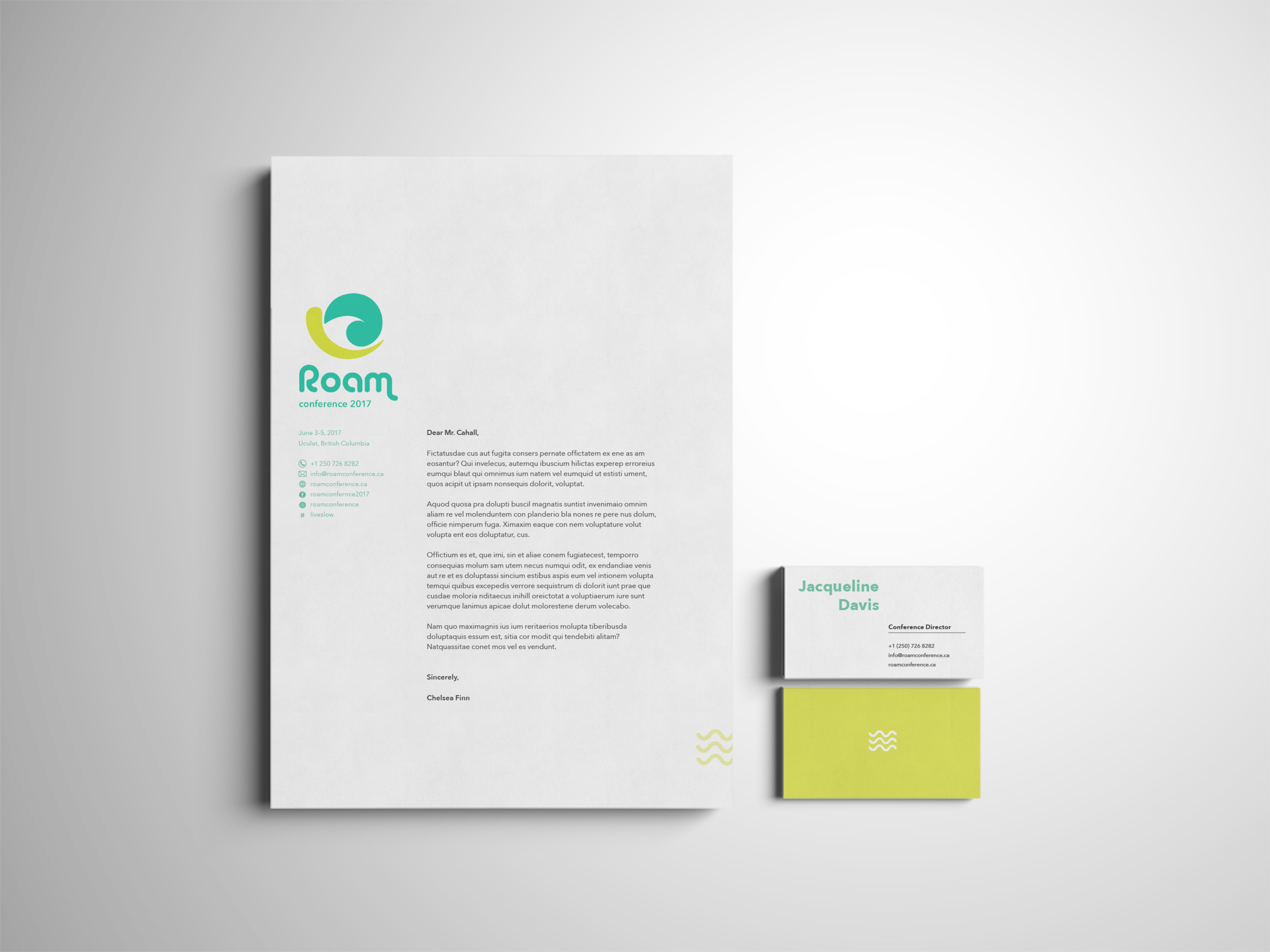
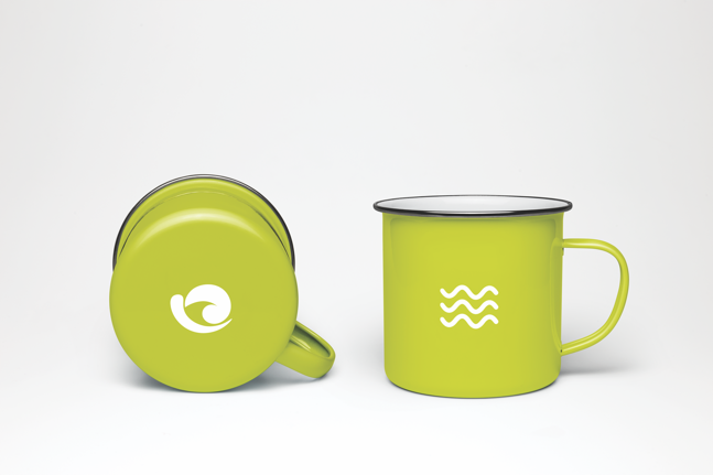
The logo designed for Roam Conference is essentially a stylized snail. The snail is symbolic of the conference for a number of reasons. Firstly, the tagline of the conference is “live slow”. A snail has long been associated with a slower pace, so it is a fitting to use a snail as a symbol to represent the ethos of the conference. Secondly, the snail is a nomadic animal; it carries its home on its back wherever it travels. As the primary target of attendees are individuals who lead a nomadic life, the snail is also a symbol of this. Finally, the logo has been designed so that there is a wave shape in the negative space between the shell and the body of the snail. The wave is an explicit tie to the surf aspect of the conference.


Primary Brand Colours
Secondary Brand Colours
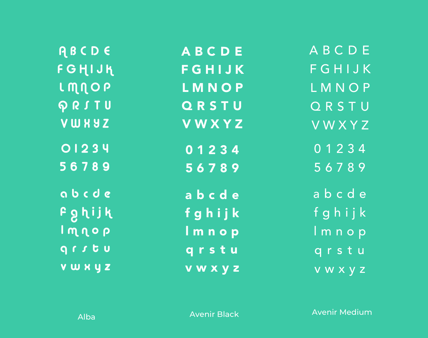
Typography
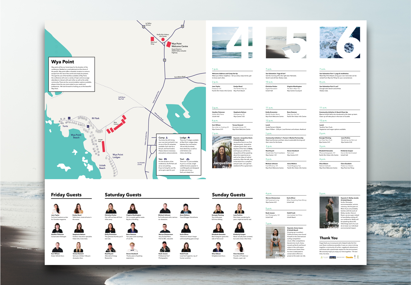
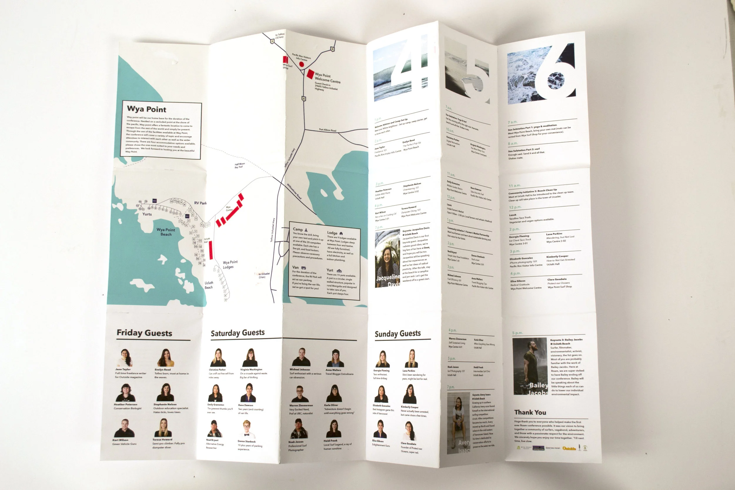
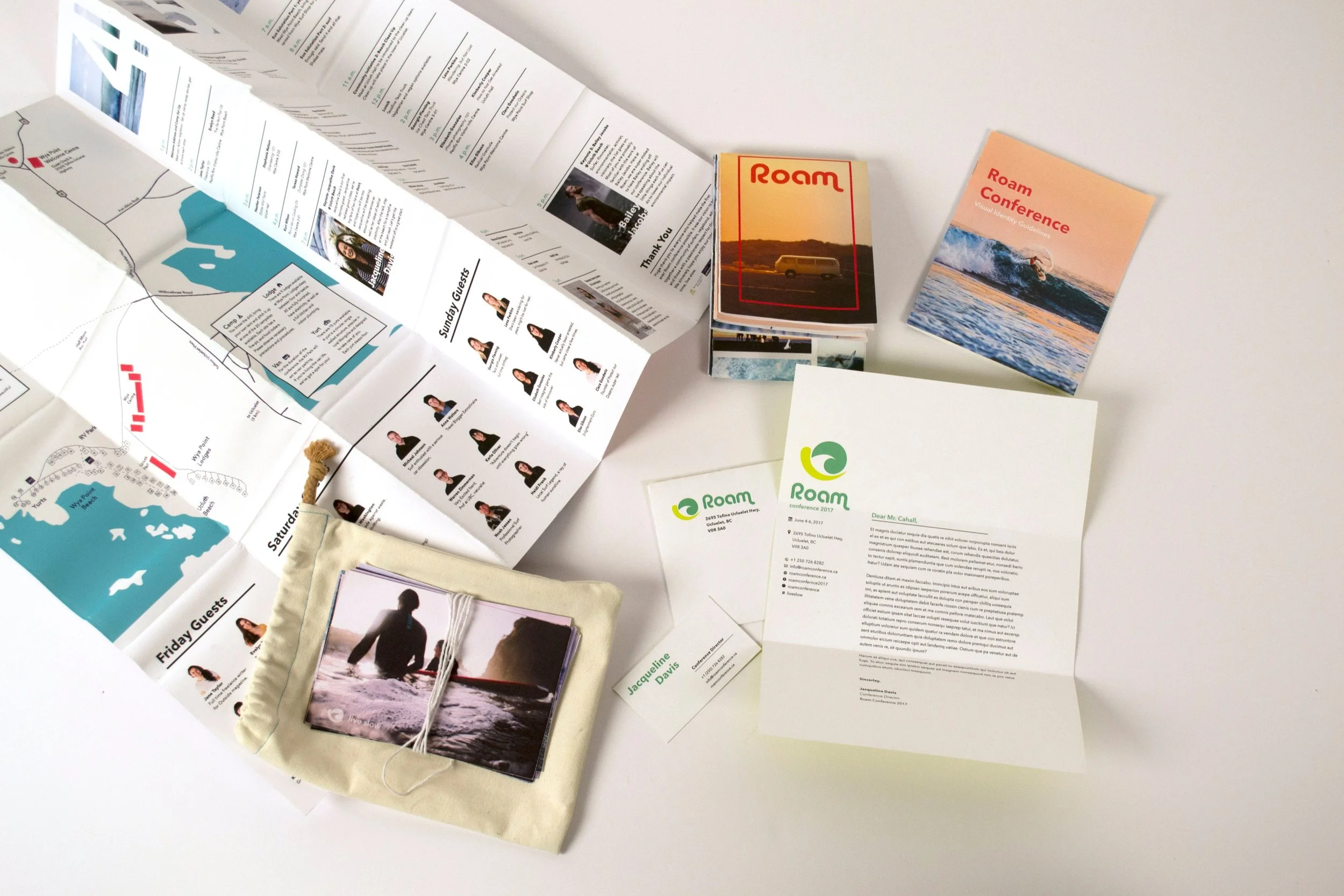
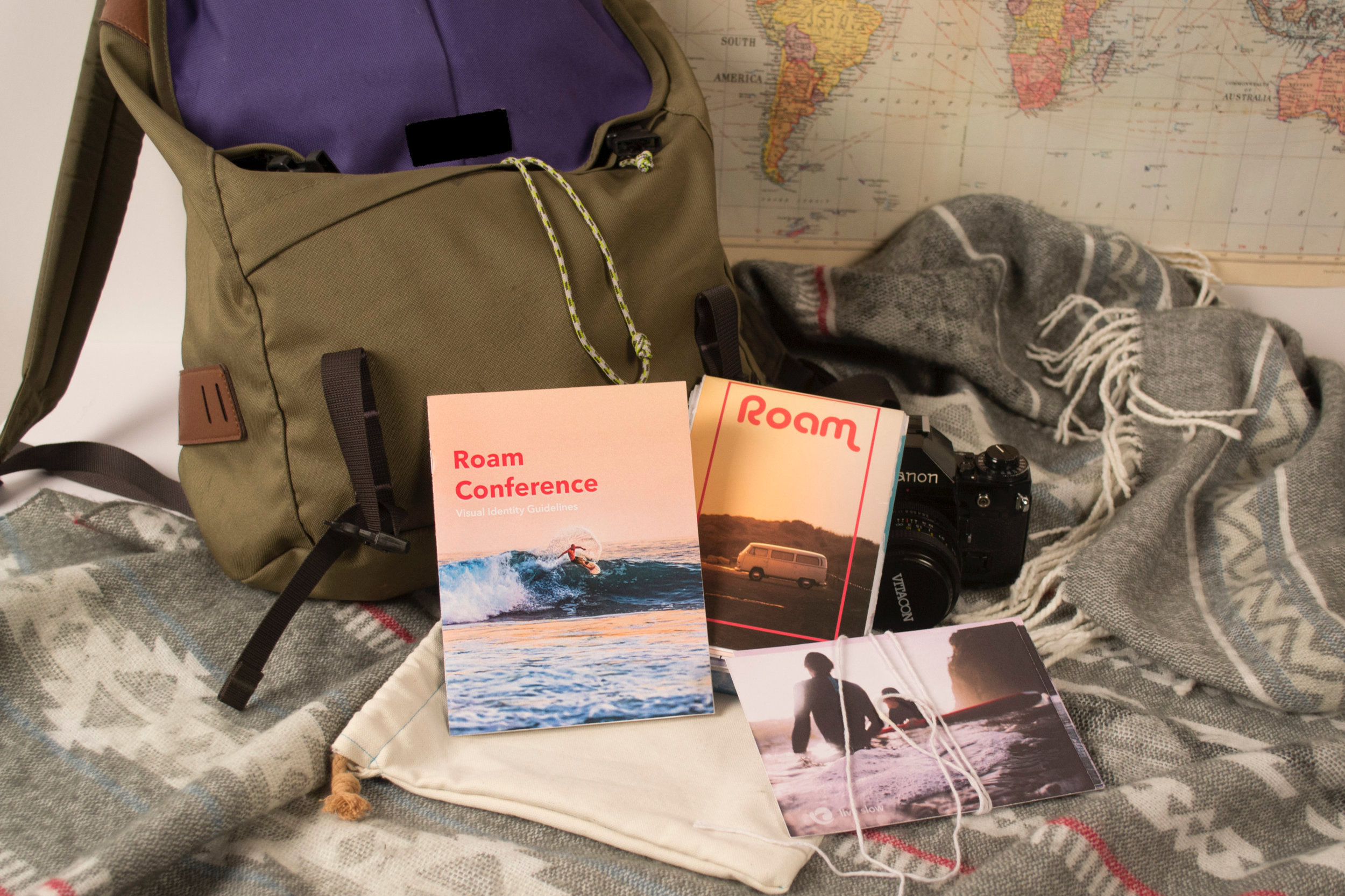
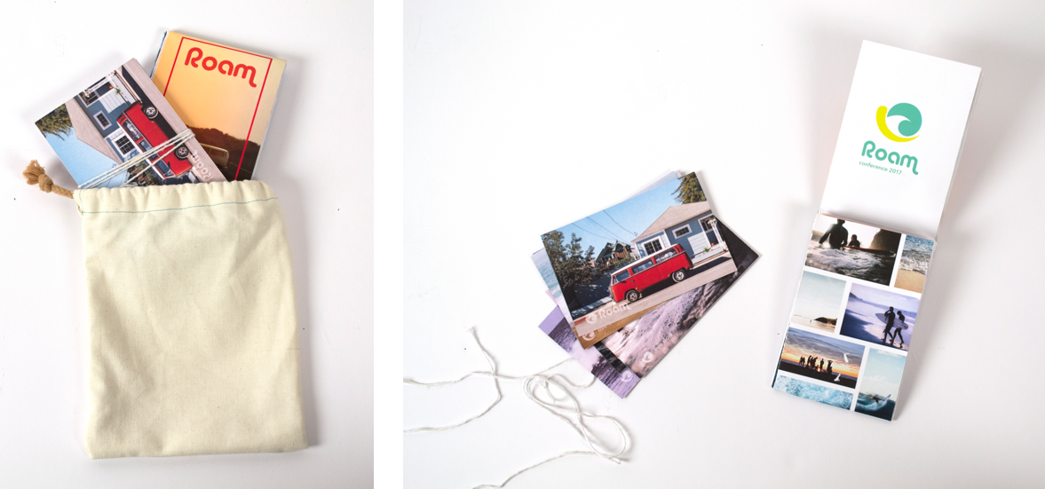
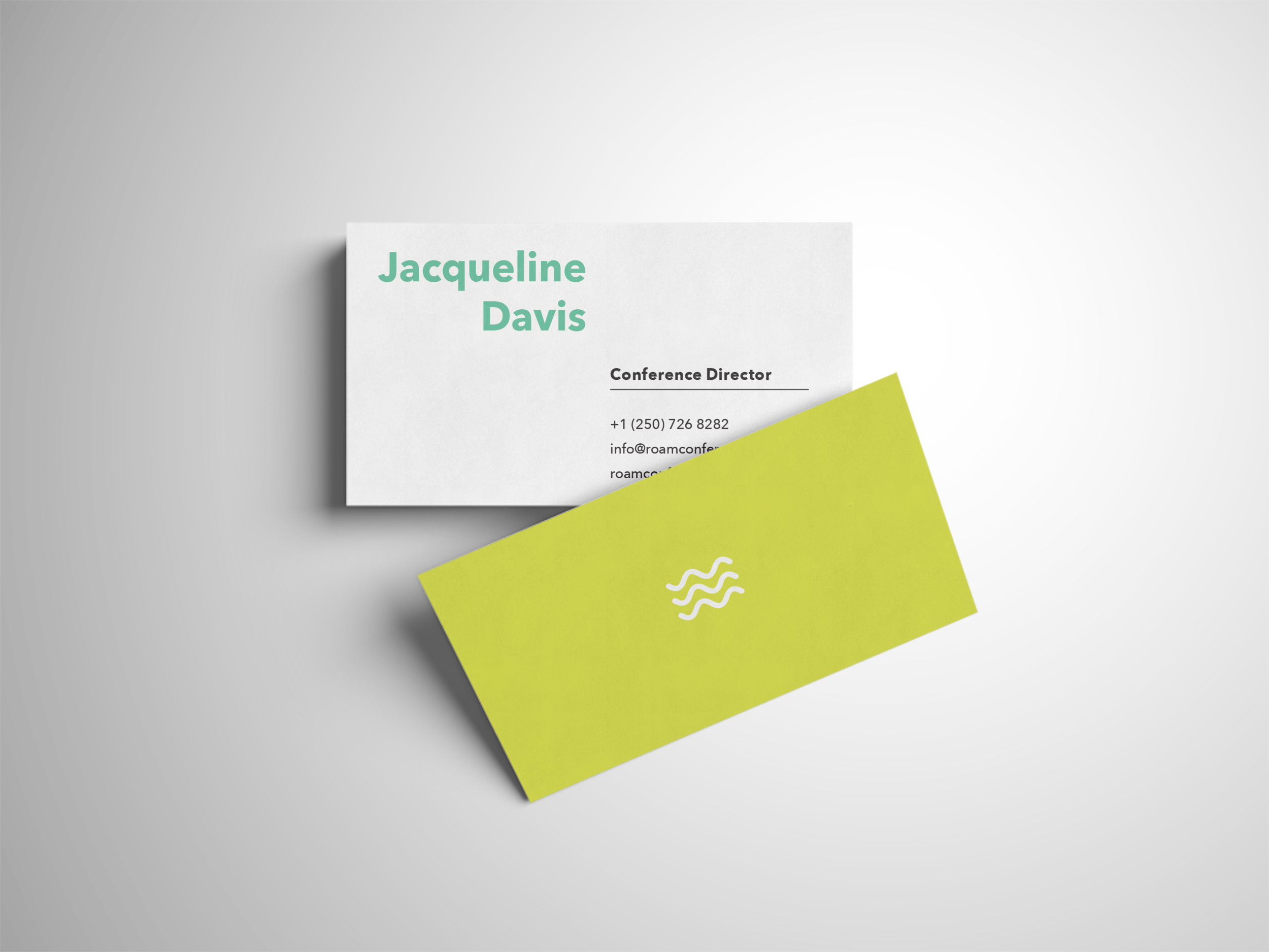
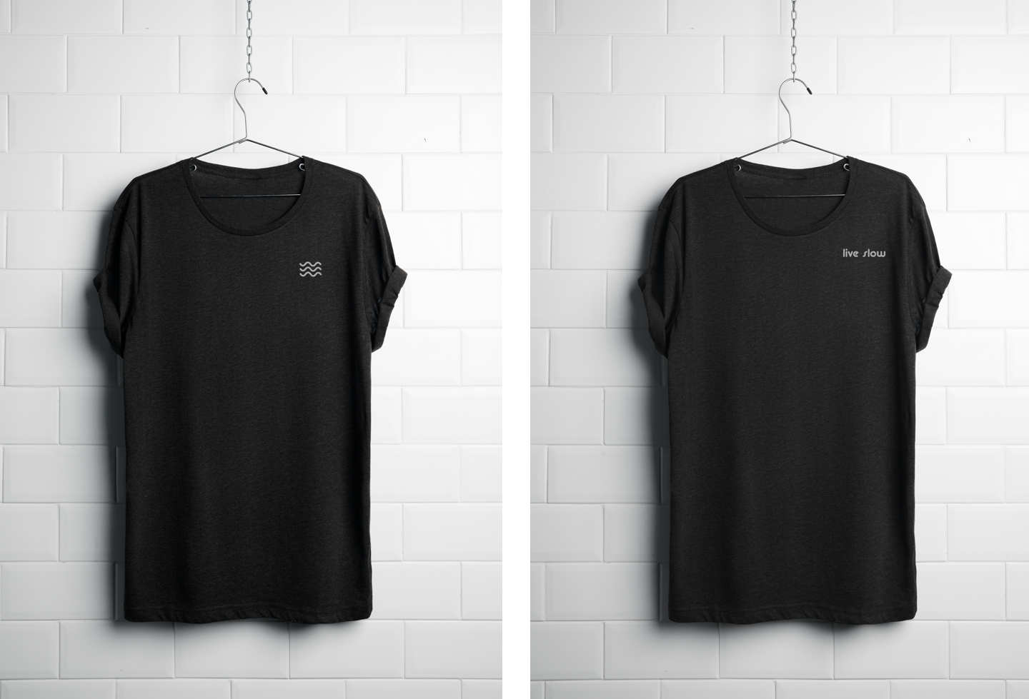
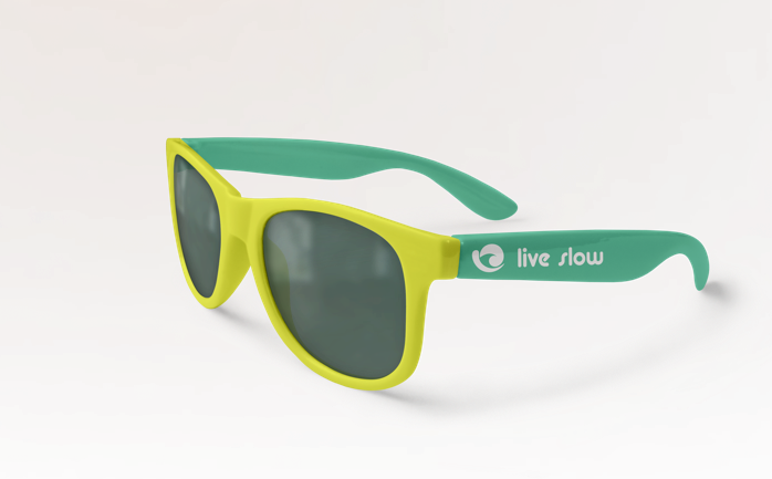
Conference Materials

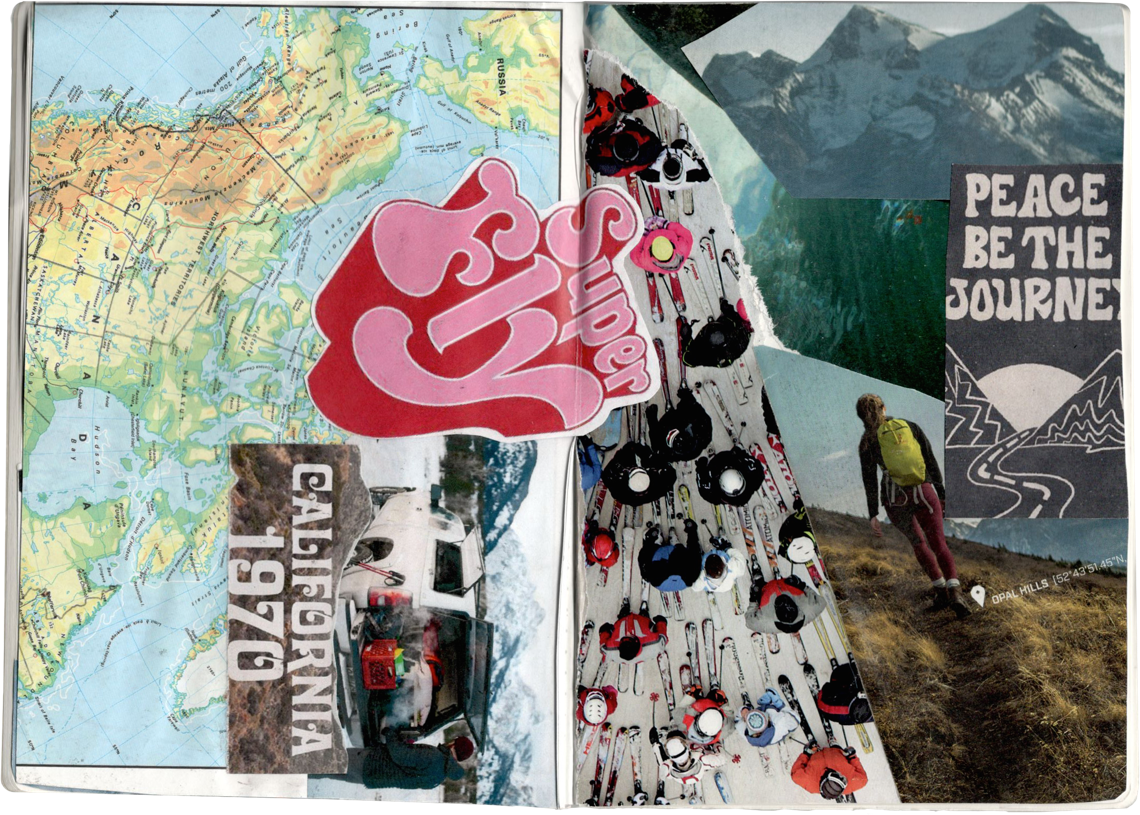
Moodboards
Couple collages to get the vibe just right.